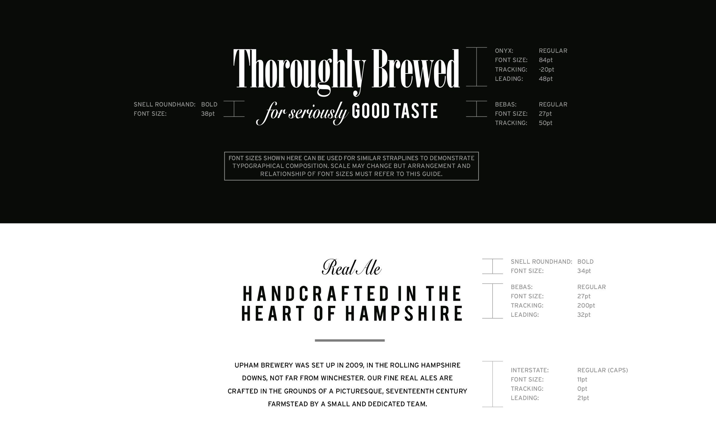
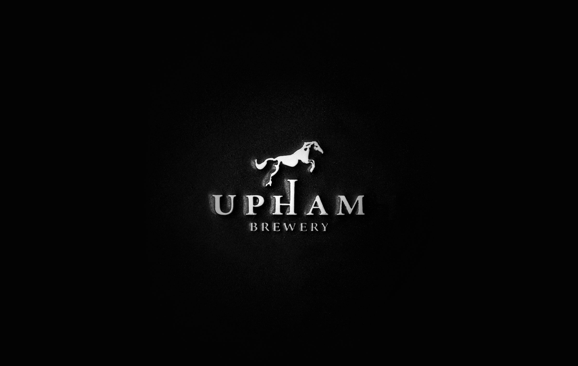
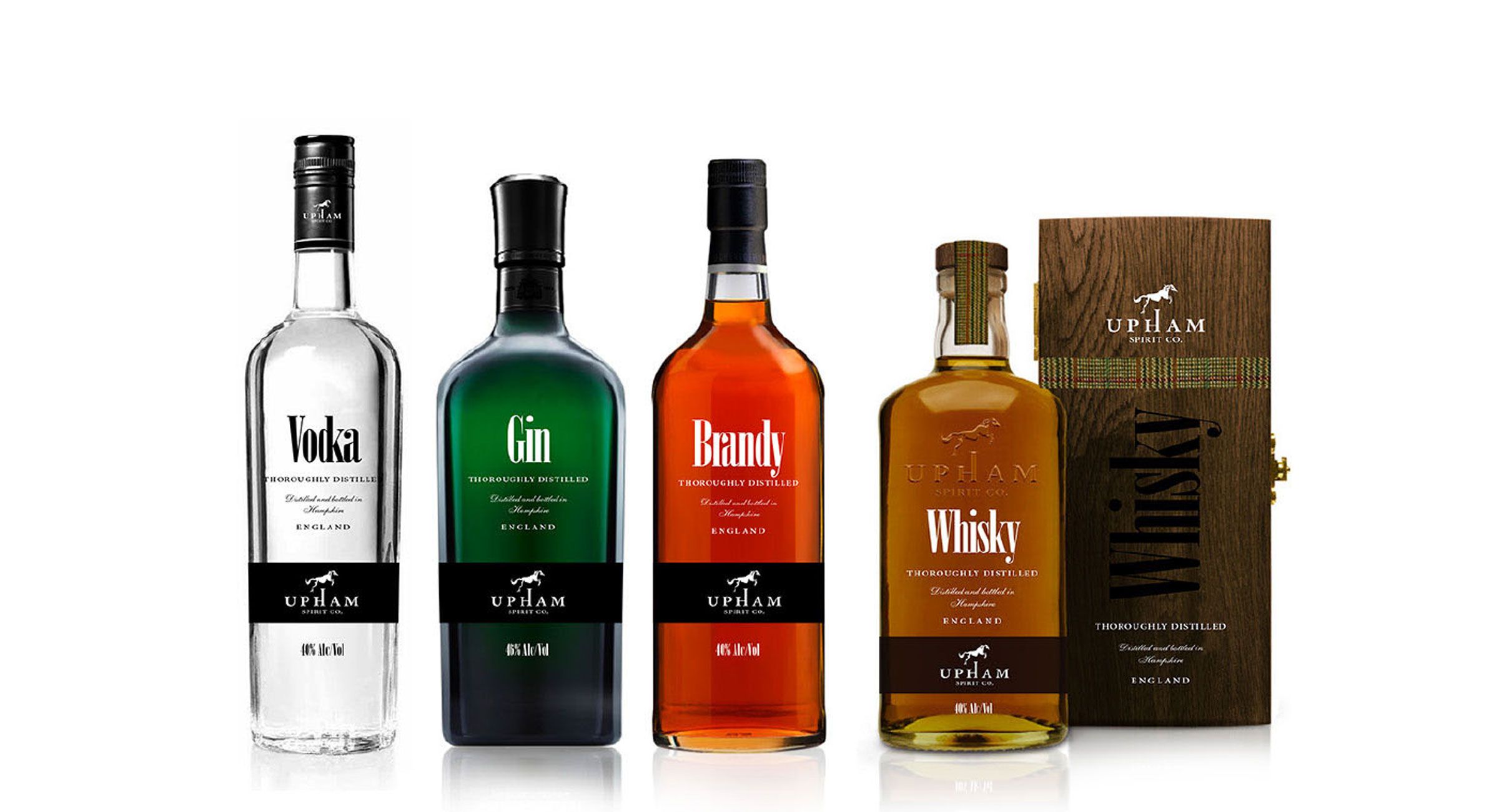
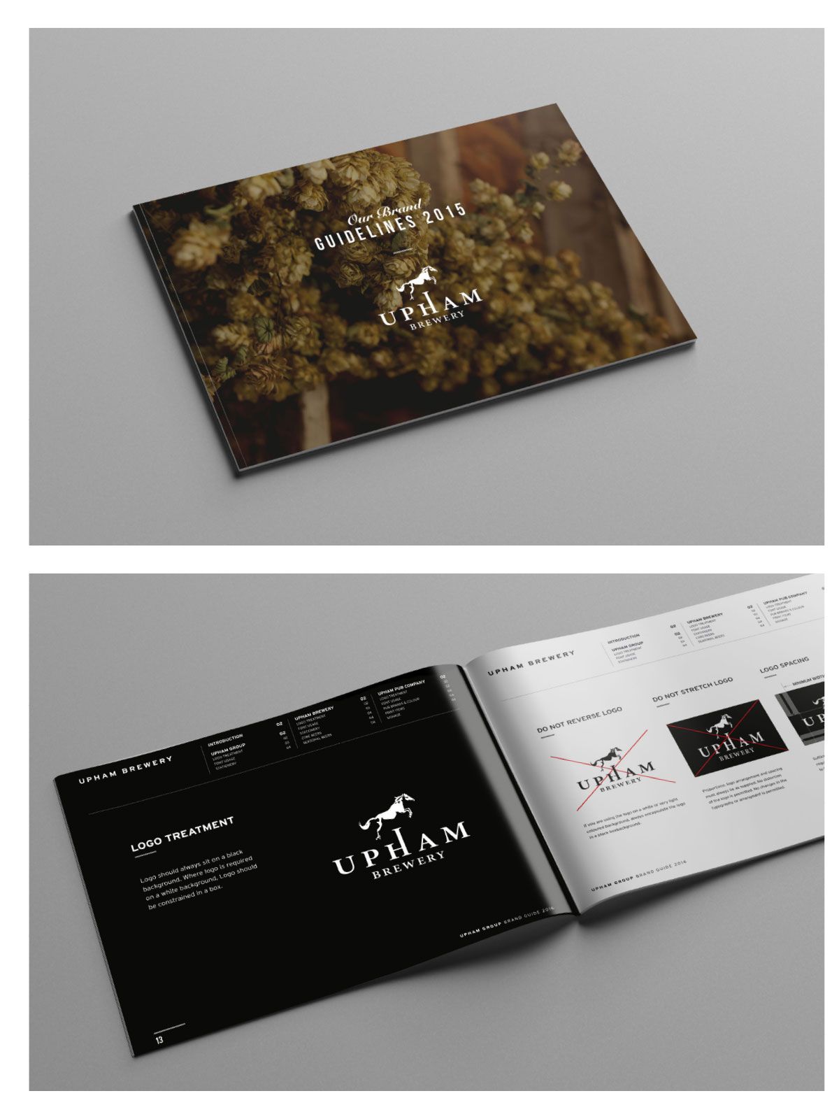
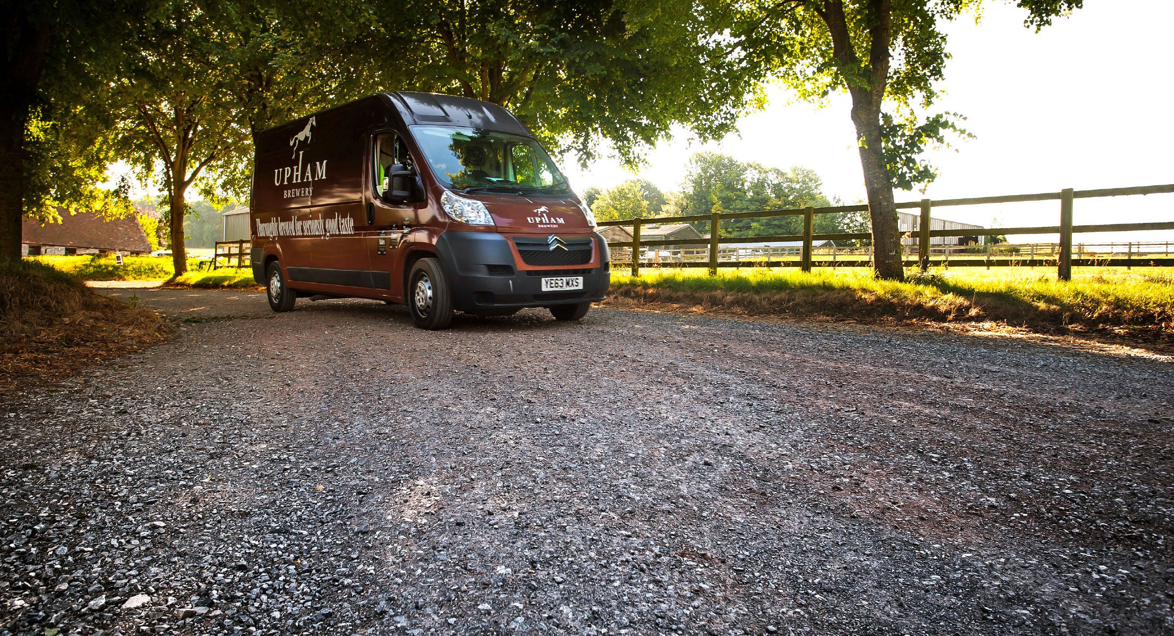
Upham Brewery is a Hampshire based brewery on stable grounds in a small village called Upham. It was part of the brief on inception of the brand that the logo includes a horse. A white horse has been illustrated jumping an 'H' for Hampshire creating the start of a simple, crisp and authentic brand relating perfectly to the area and the character of the beer. 'Thoroughly Brewed for seriously good taste' is a brand message thought up to refer taste as two meanings and a 'Thoroughbred' horse or great beer.
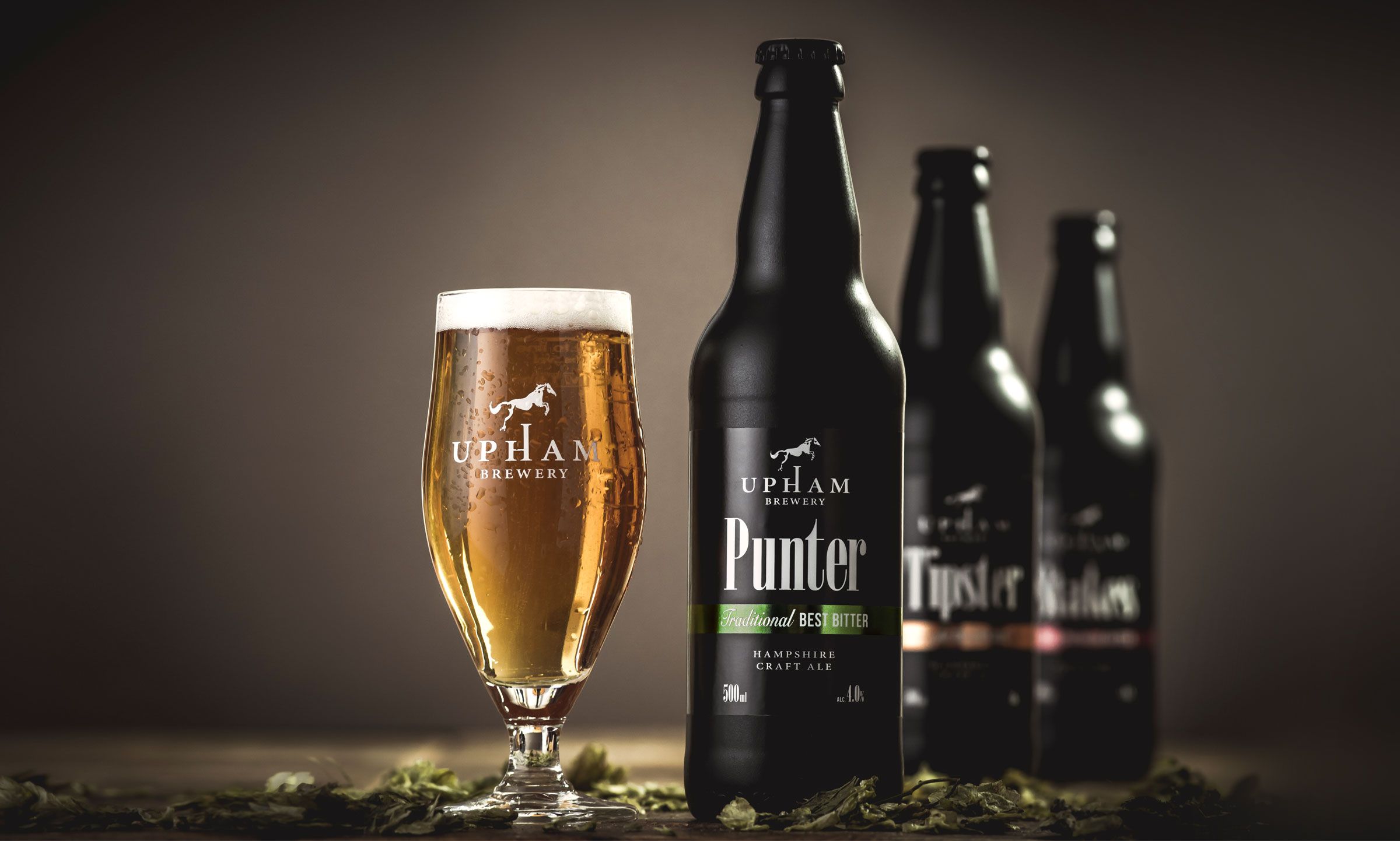
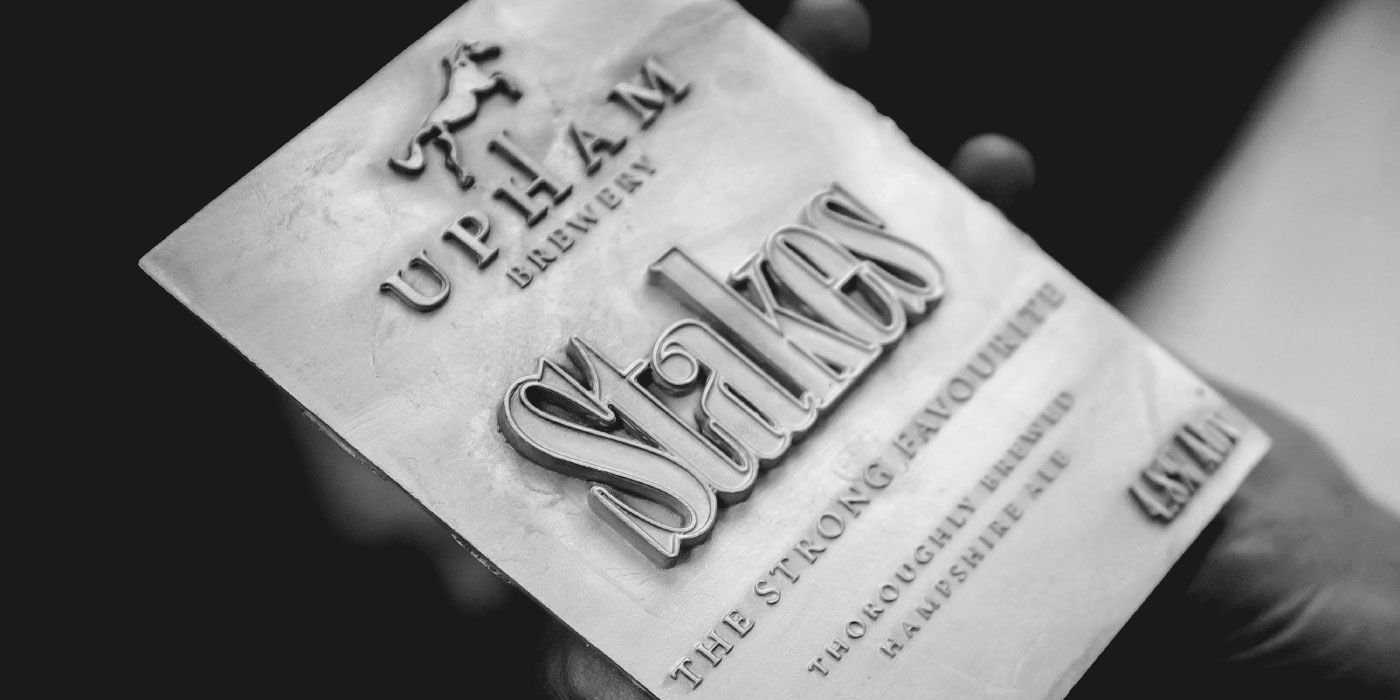
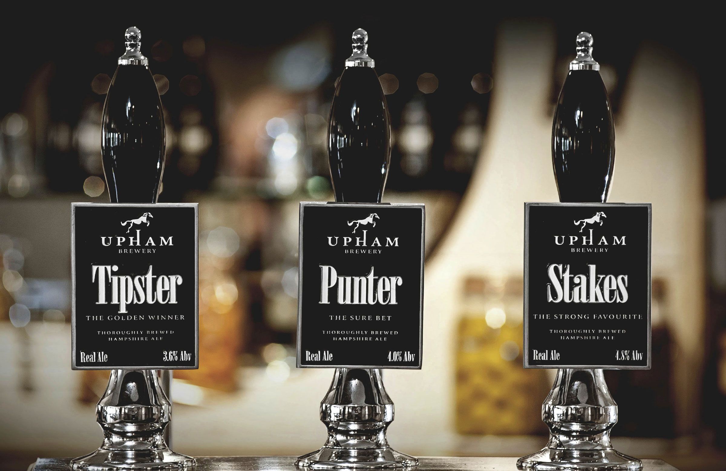
The bottle labels are printed on a metallic substrate which works well for the metallic coloured bands, the glass is acid etched and hops has been used to style the shot and provides a good consistency with the brand tying in nicely with the hero shot of hops in stables (behind the logo at the head of this page). The core pump clips were cast in pewter in black and white for an almost antique look which works well in a classic pub and stands proud in black and white amongst the many coloured clips you generally find on the bar.
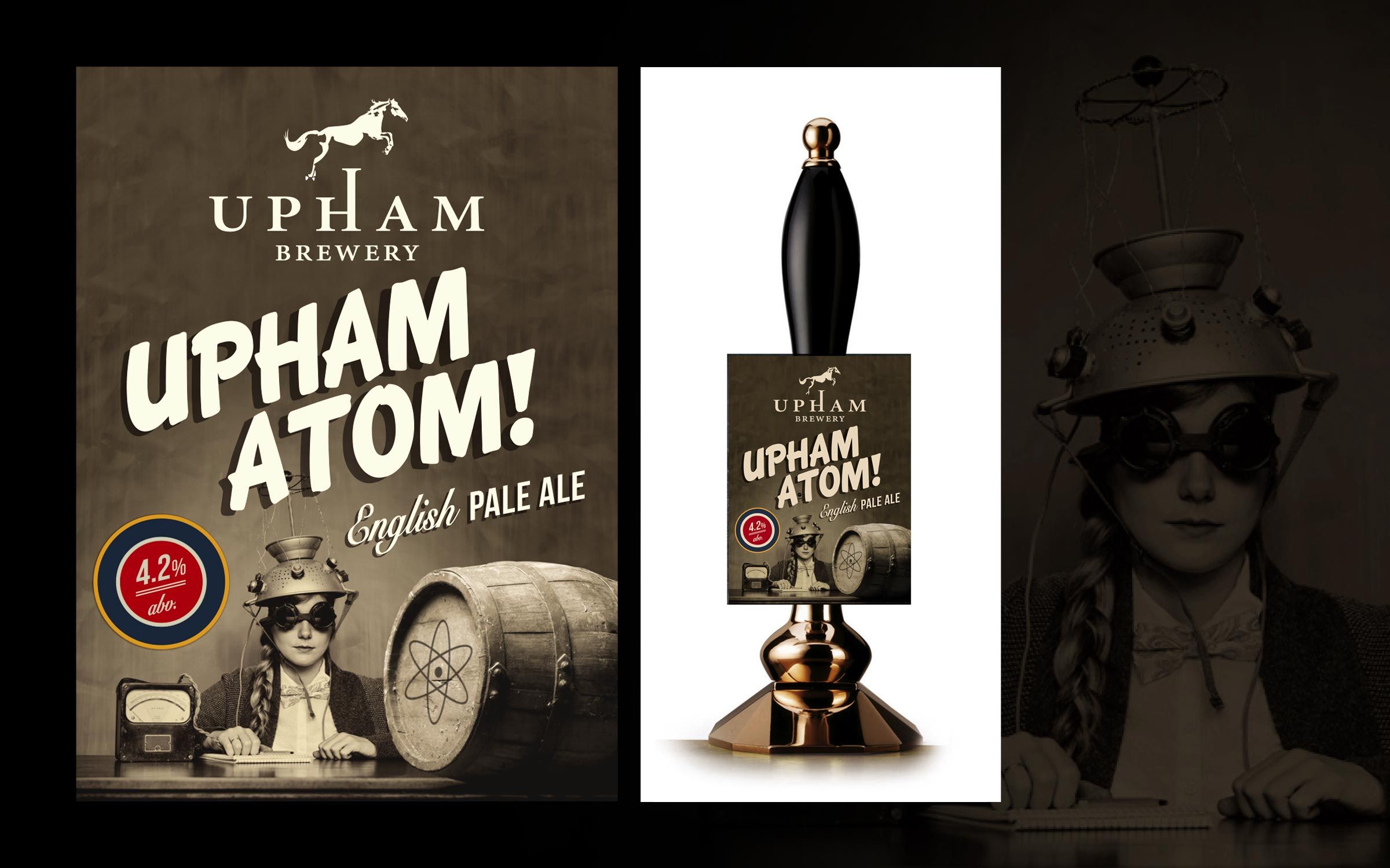
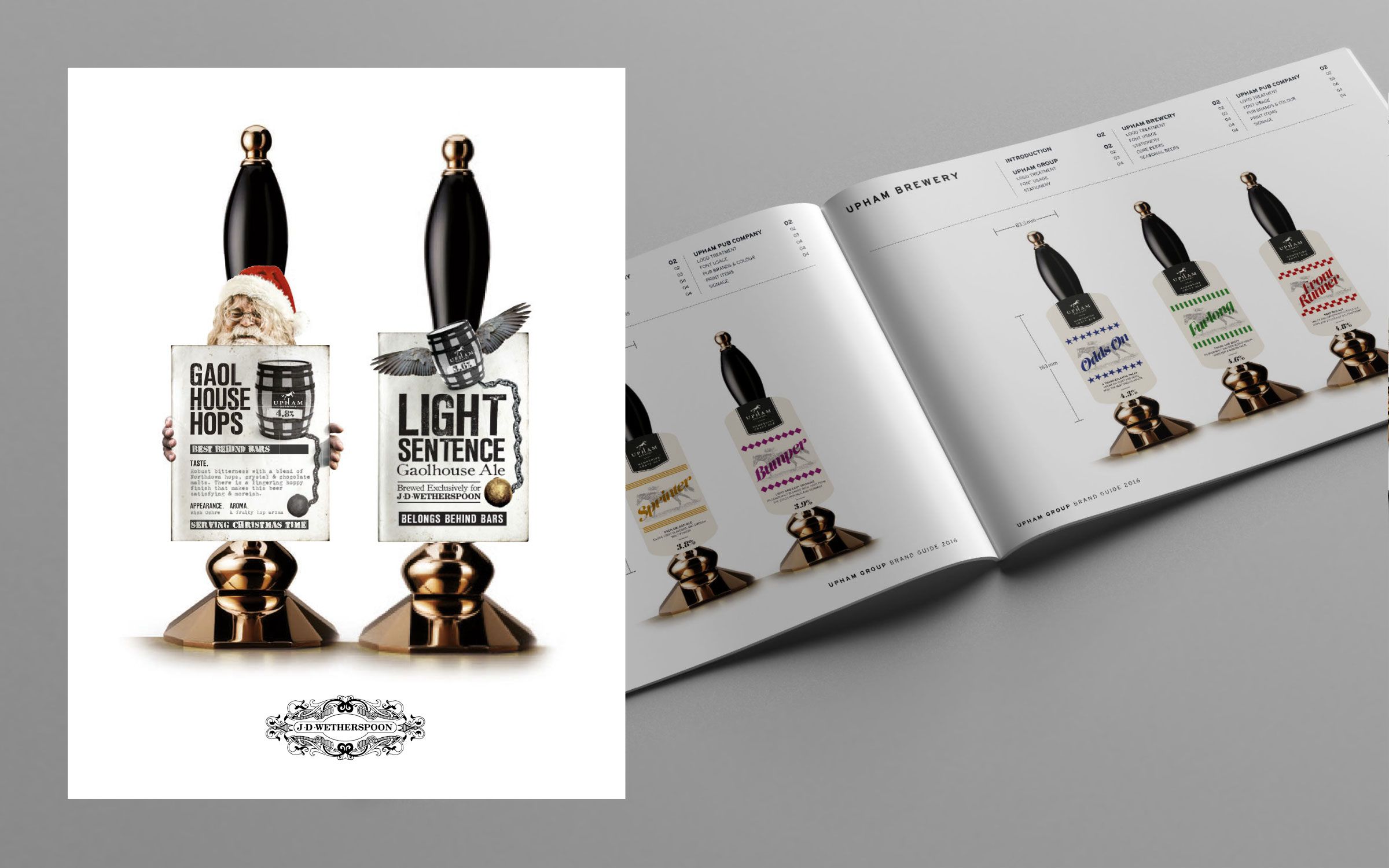
Other concepts for other clips and beers add more character to the brand, the Upham beers for a Wetherspoons pub were ideas designed with the pub name, the Gaol House in mind and biannual clips went with a racing theme each being styled like jockey silks/colours. Please note that the photo used for 'Upham Atom' was not taken by myself.
