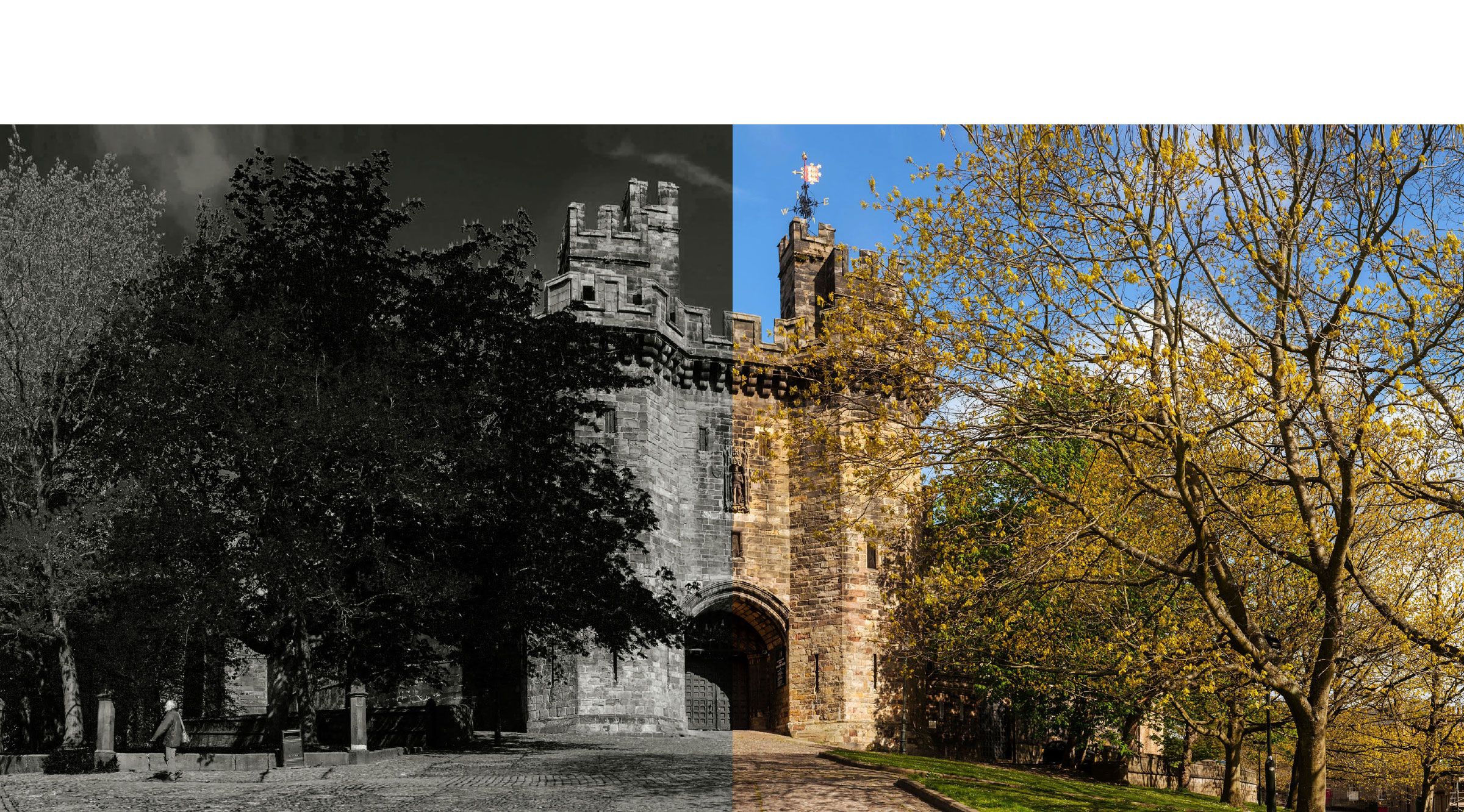
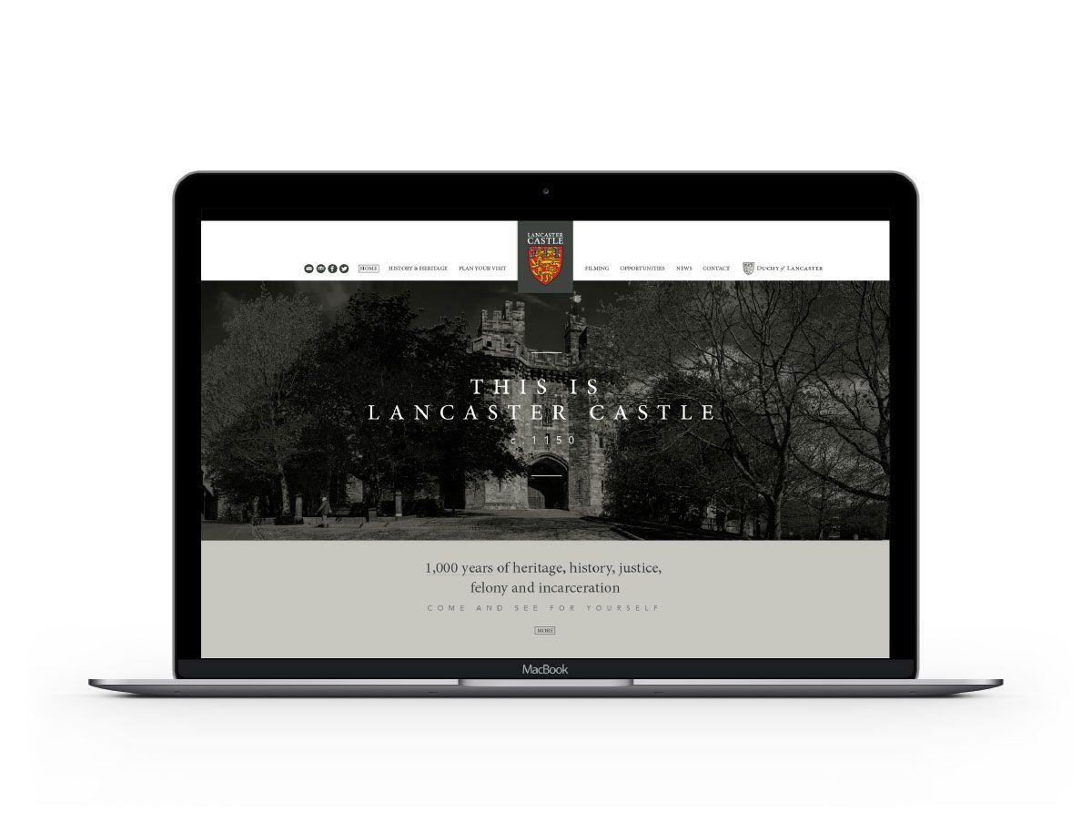
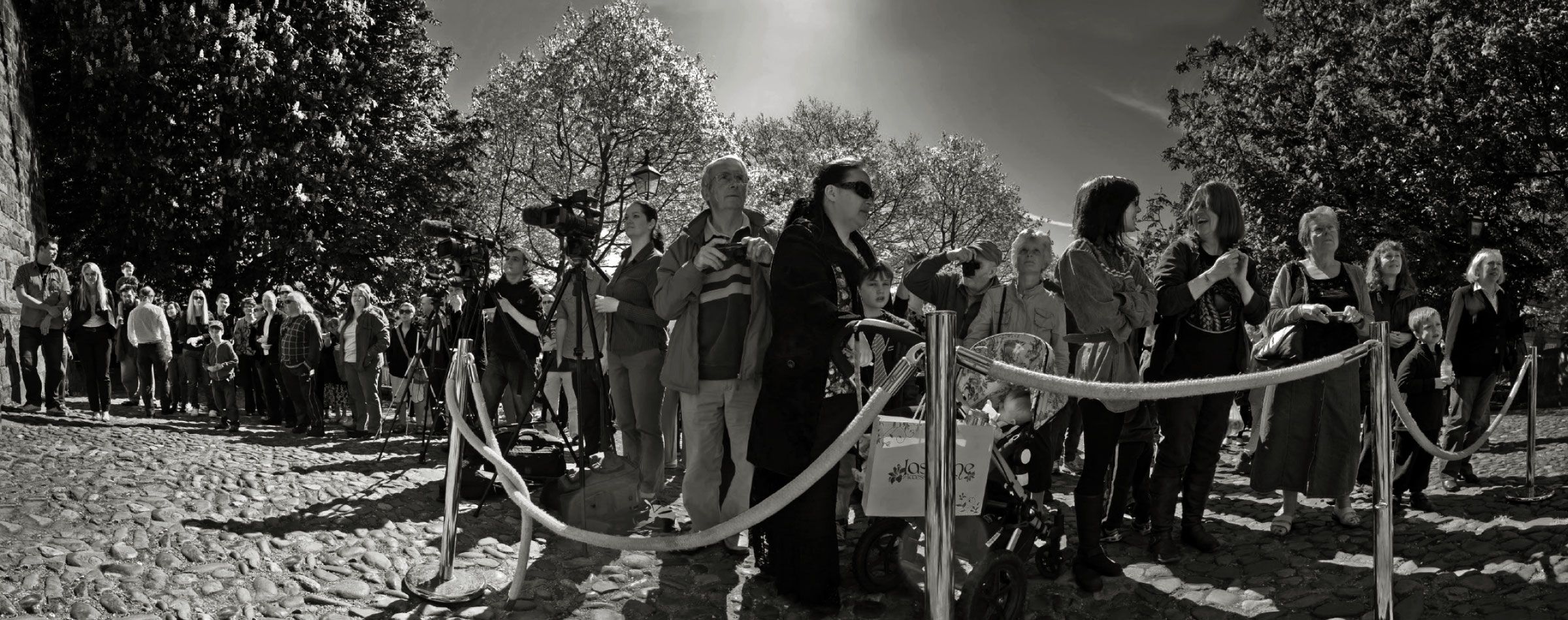
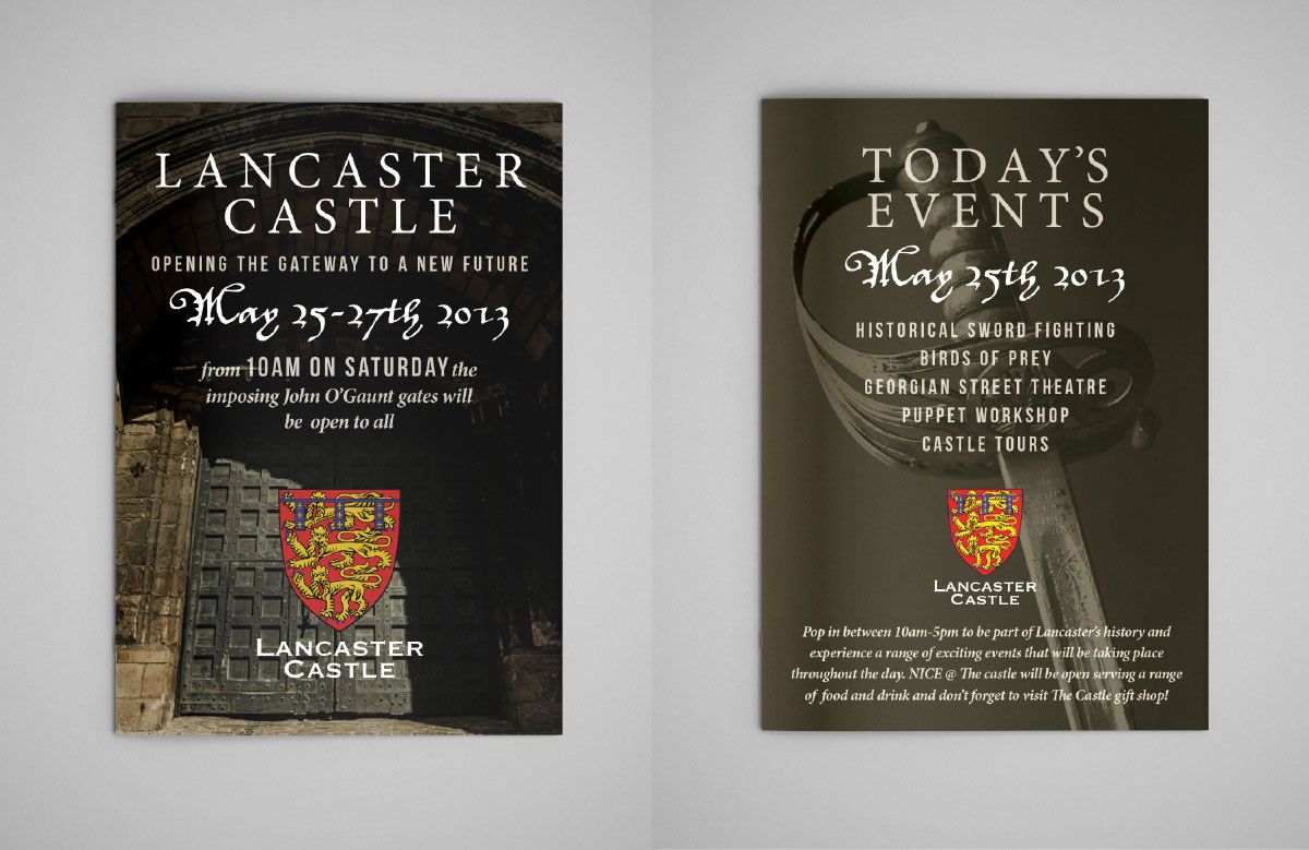
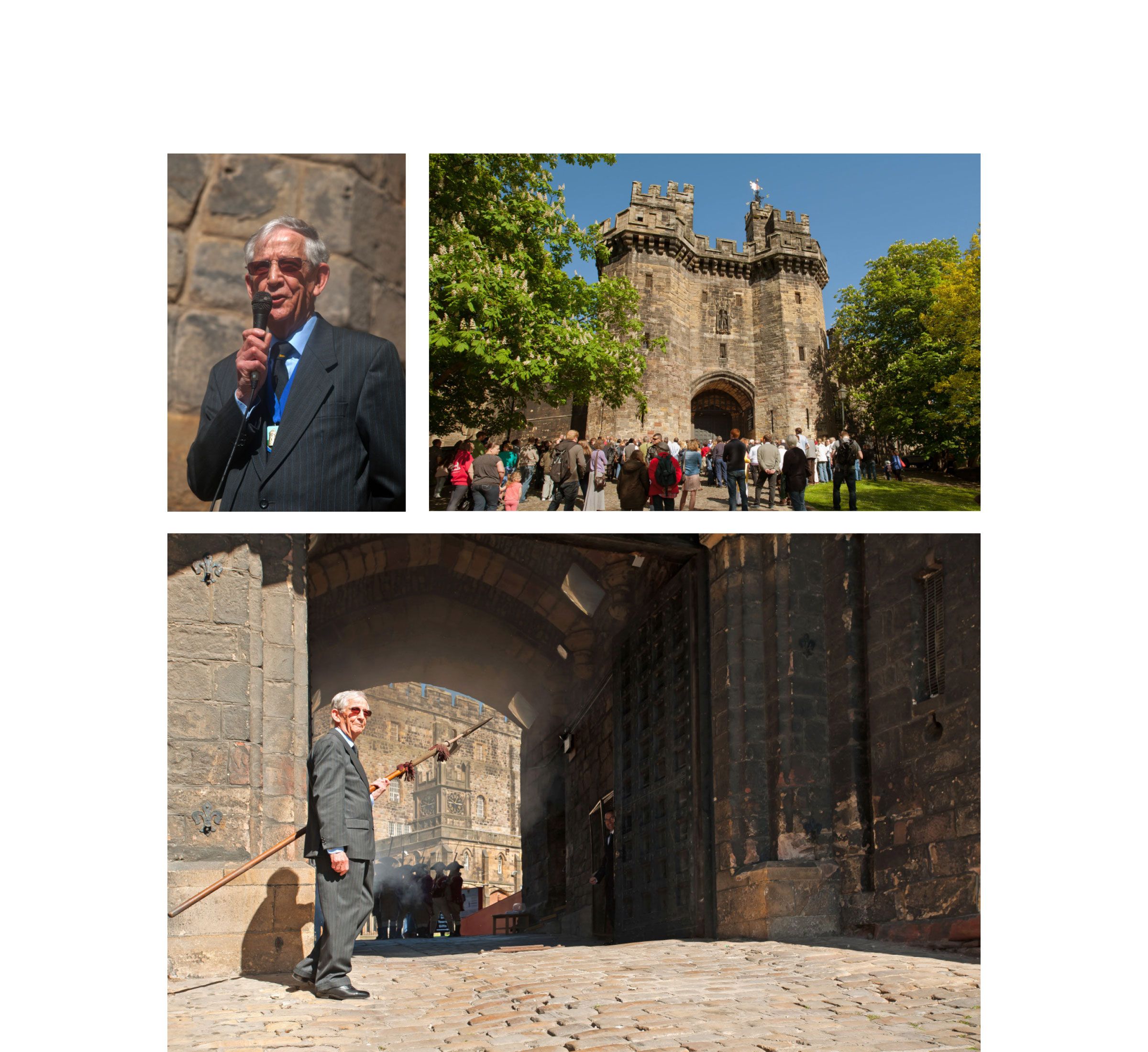
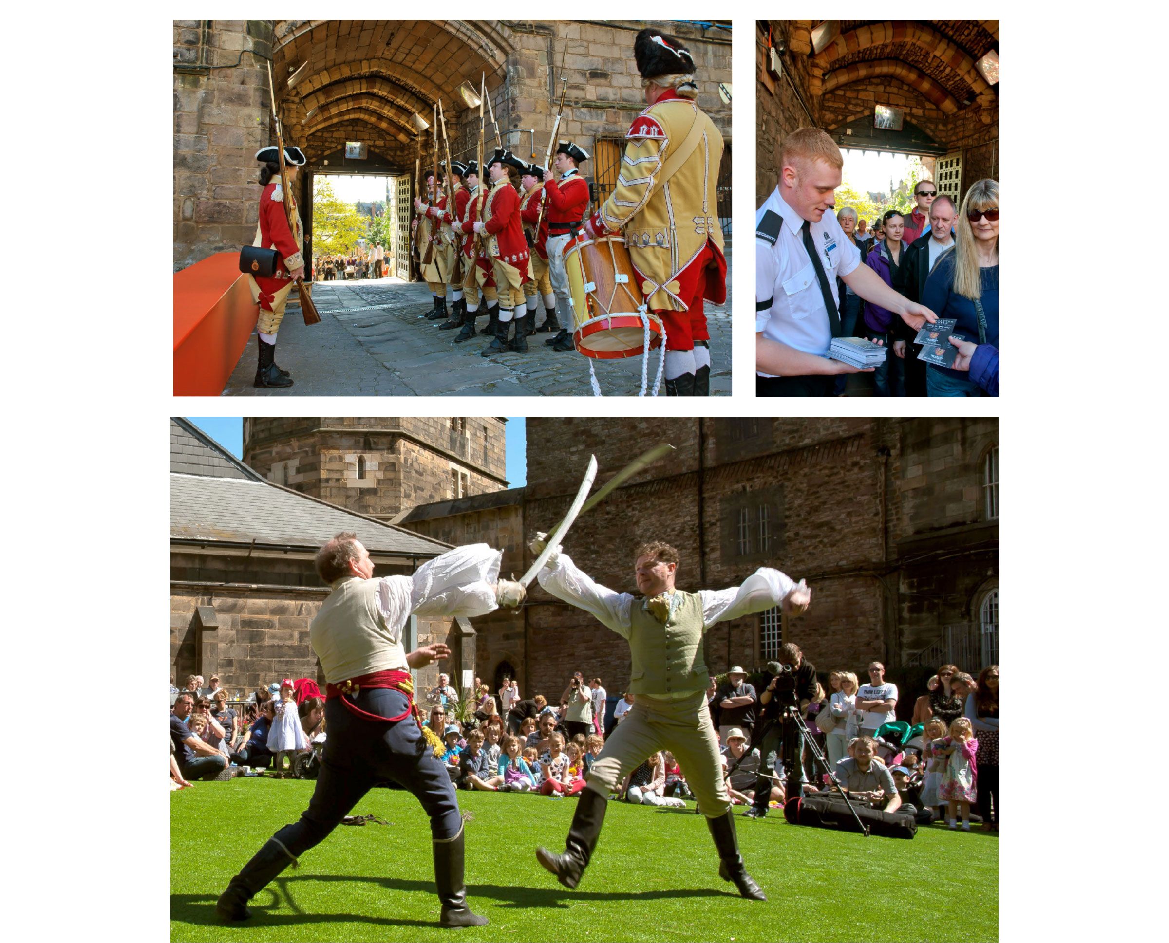
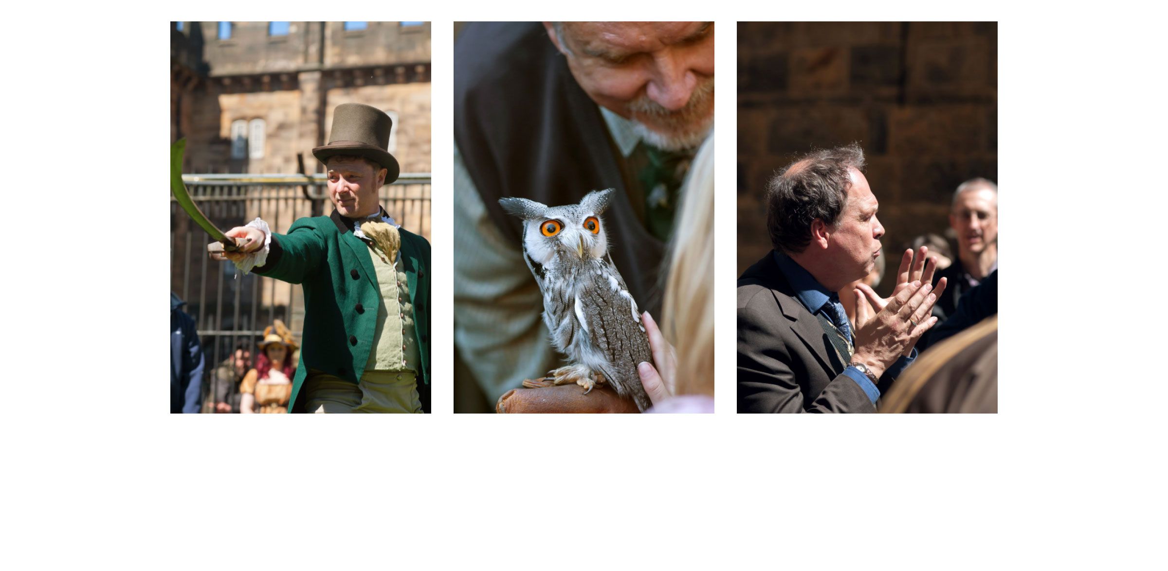
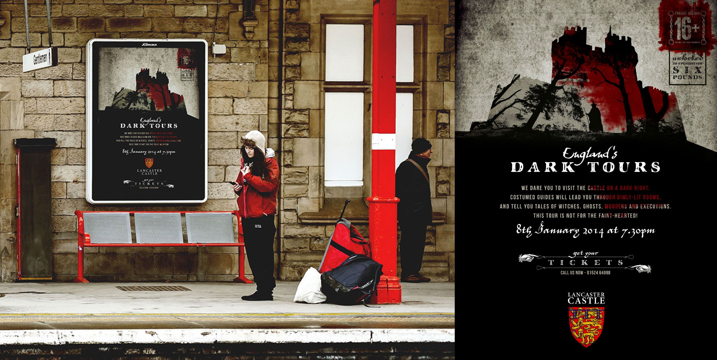
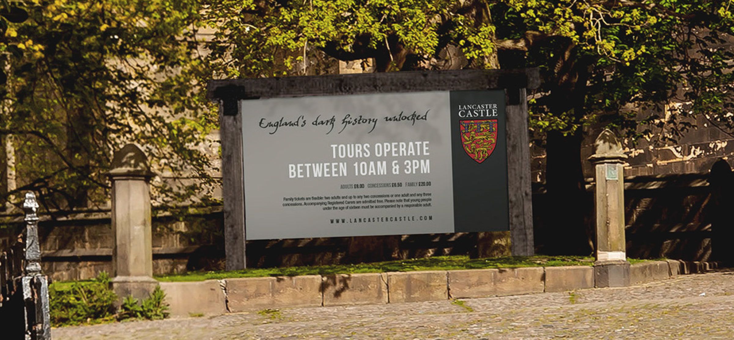
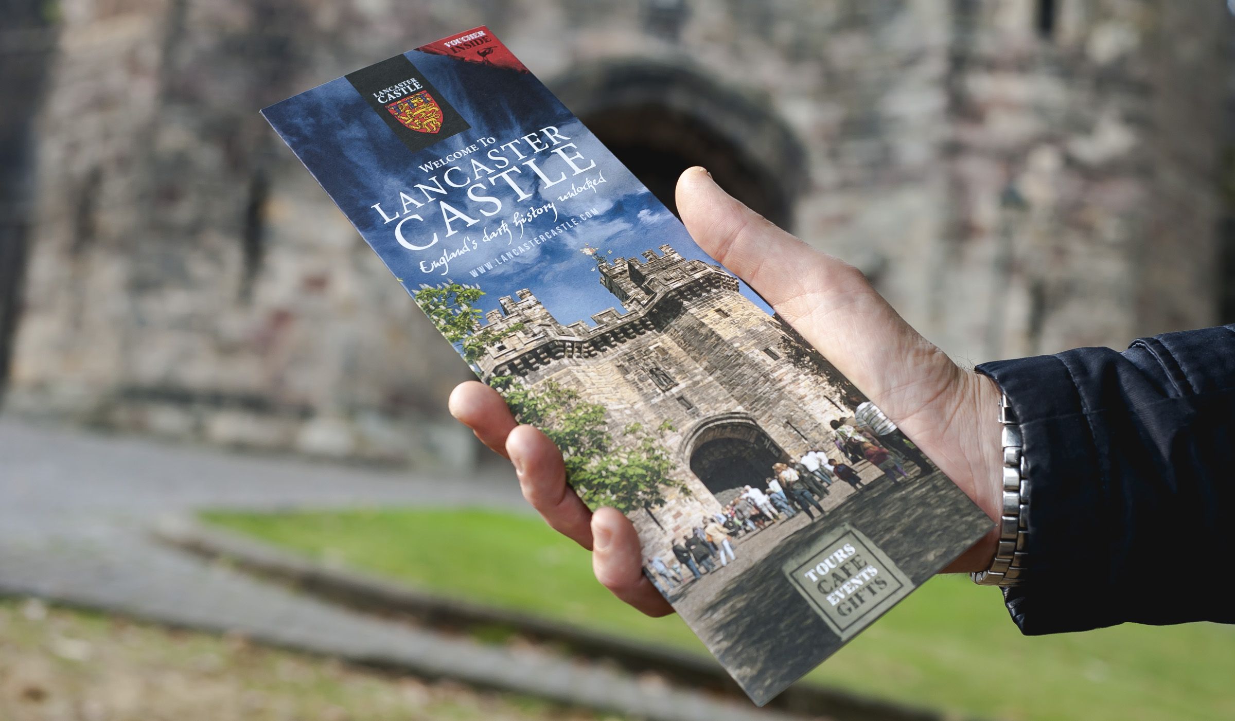
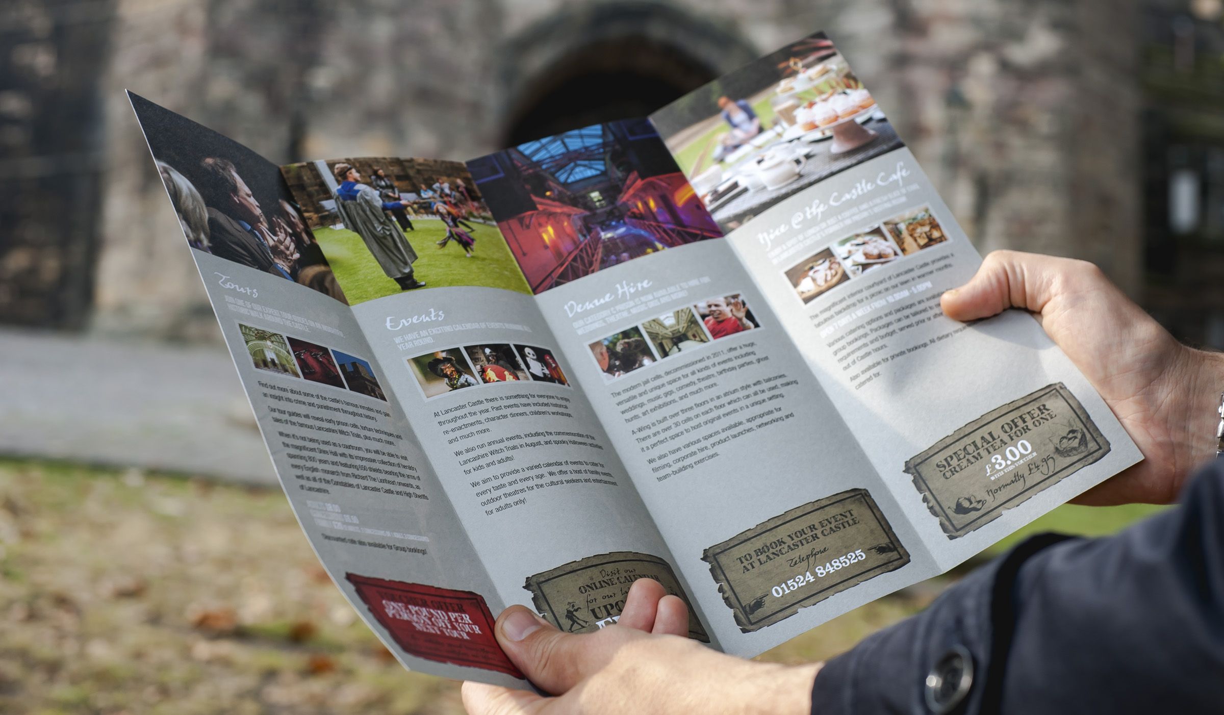
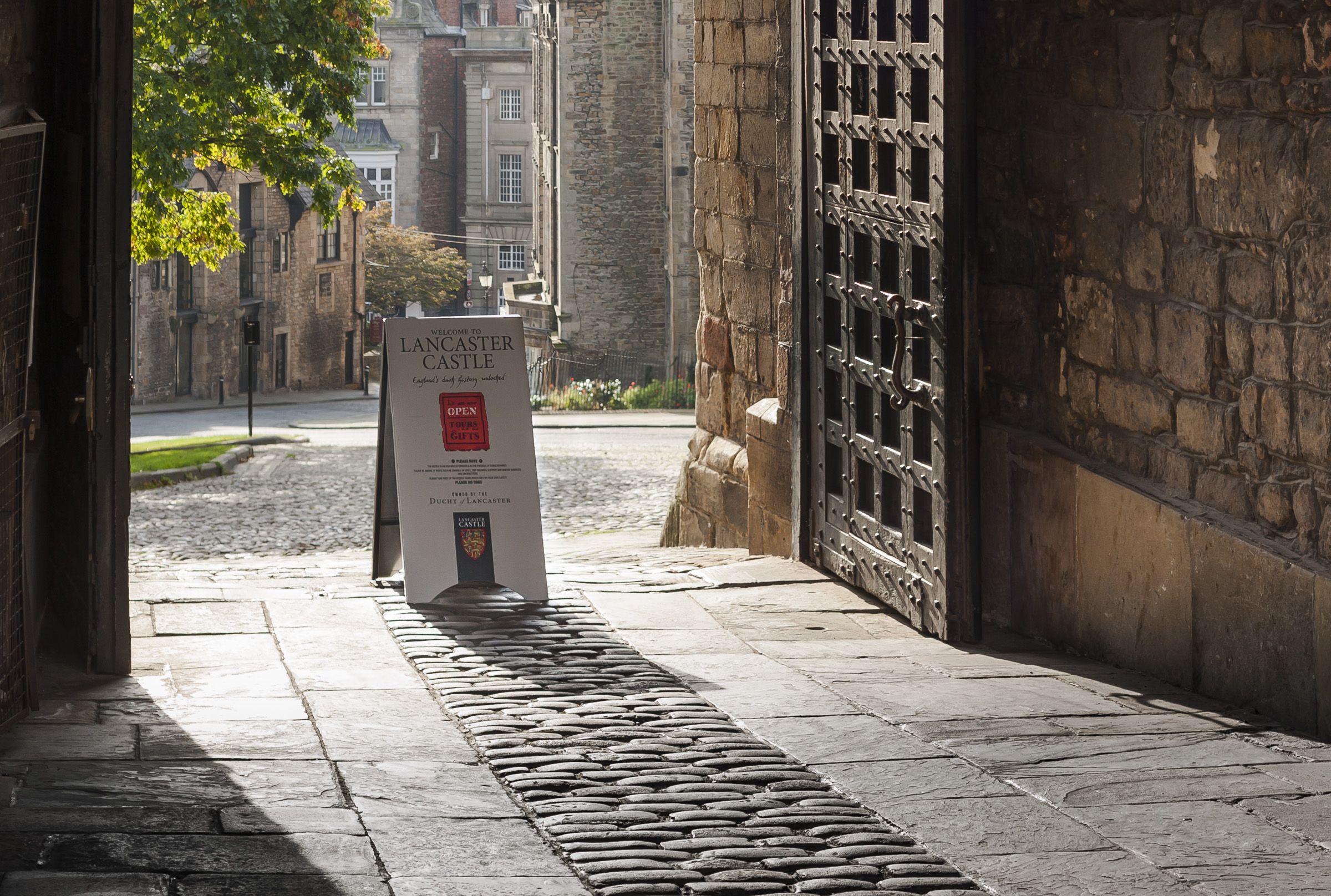
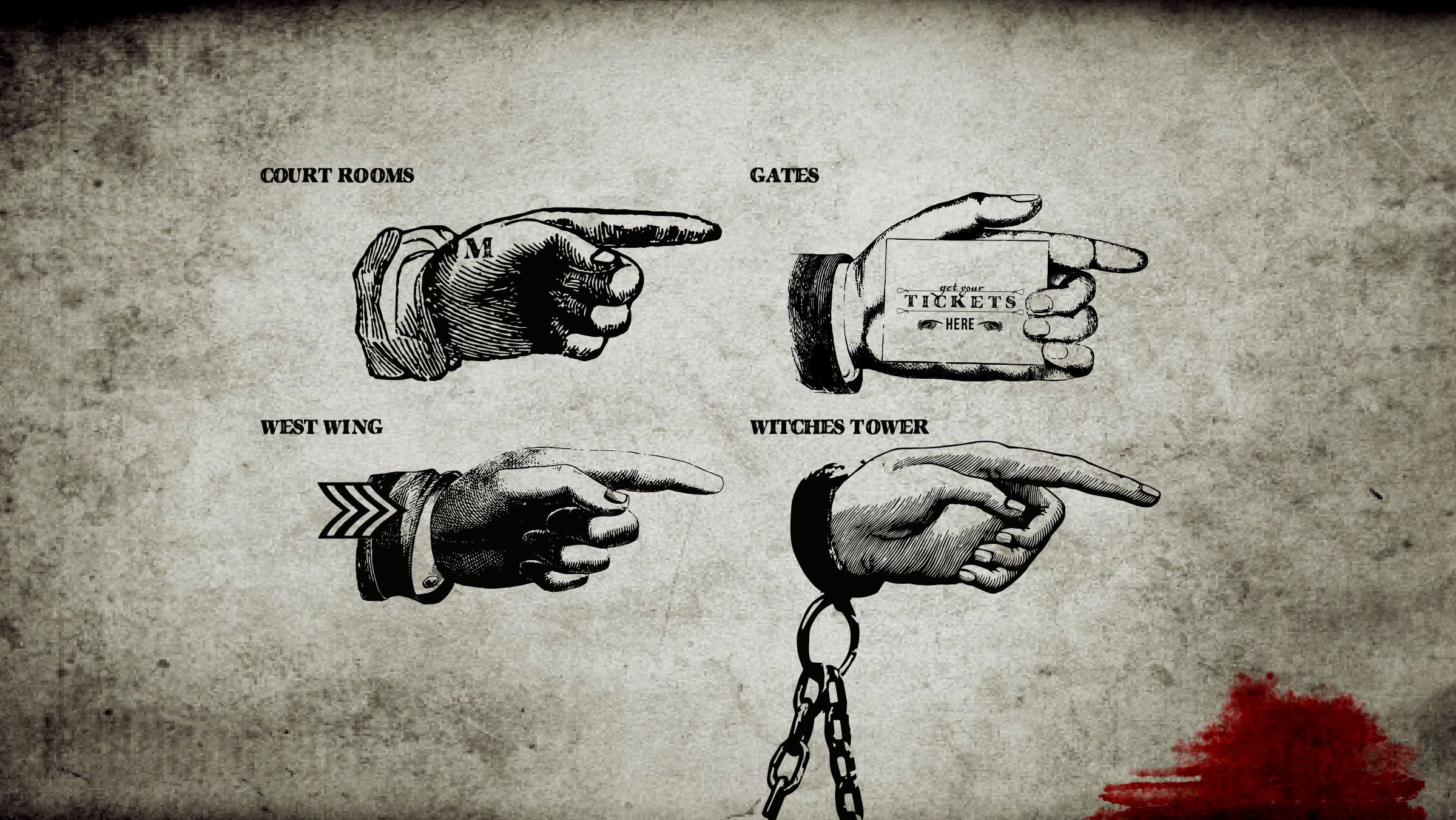
My work with the Duchy of Lancaster was both design and photography for the rebrand of Lancaster Castle in May 2013 as a new tourist attraction. The castle was formerly a prison for a number of years and I was really fortunate to have been one of the first free members of the public through the gates to take photographs, not to mention being lucky enough to carry out the design work from inception of the brand to determine the overall style.
It made perfect sense for the castle to take on the Duchy of Lancaster crest due to the history and heritage of the castle. A stone grey colour palette was decided with a red feature colour to catch some attention and surface the darker side of the castles history. The 'Witchfinder' font was also incorporated to again reflect the darker history for use in brand material.
I am immensely proud to have been involved with Lancaster Castle, it's a truly magnificent historic landmark to a town I've lived in for the best part of my life and it's been great watching things develop over the years.
